Yoco is a digital agency who was going through a phase where they wanted to renew their identity with a loyal and fresh vision of their extravagant personality, and thus be able to communicate it to their customers. They were already sure who they are and I helped them reflect that.
I was working as part of their team at the time and I was trusted to get their vision beyond. 🚀
Challenge
Shape a brand as extravagant, modern, and above all, that radiates the life and dynamism of their team, all based on the confidence to reflect who they are.
Yoco was born in the 00’s in the bloom of technology in México. They felt very belonging to the Y2K style that without a doubt, also part of its essence.
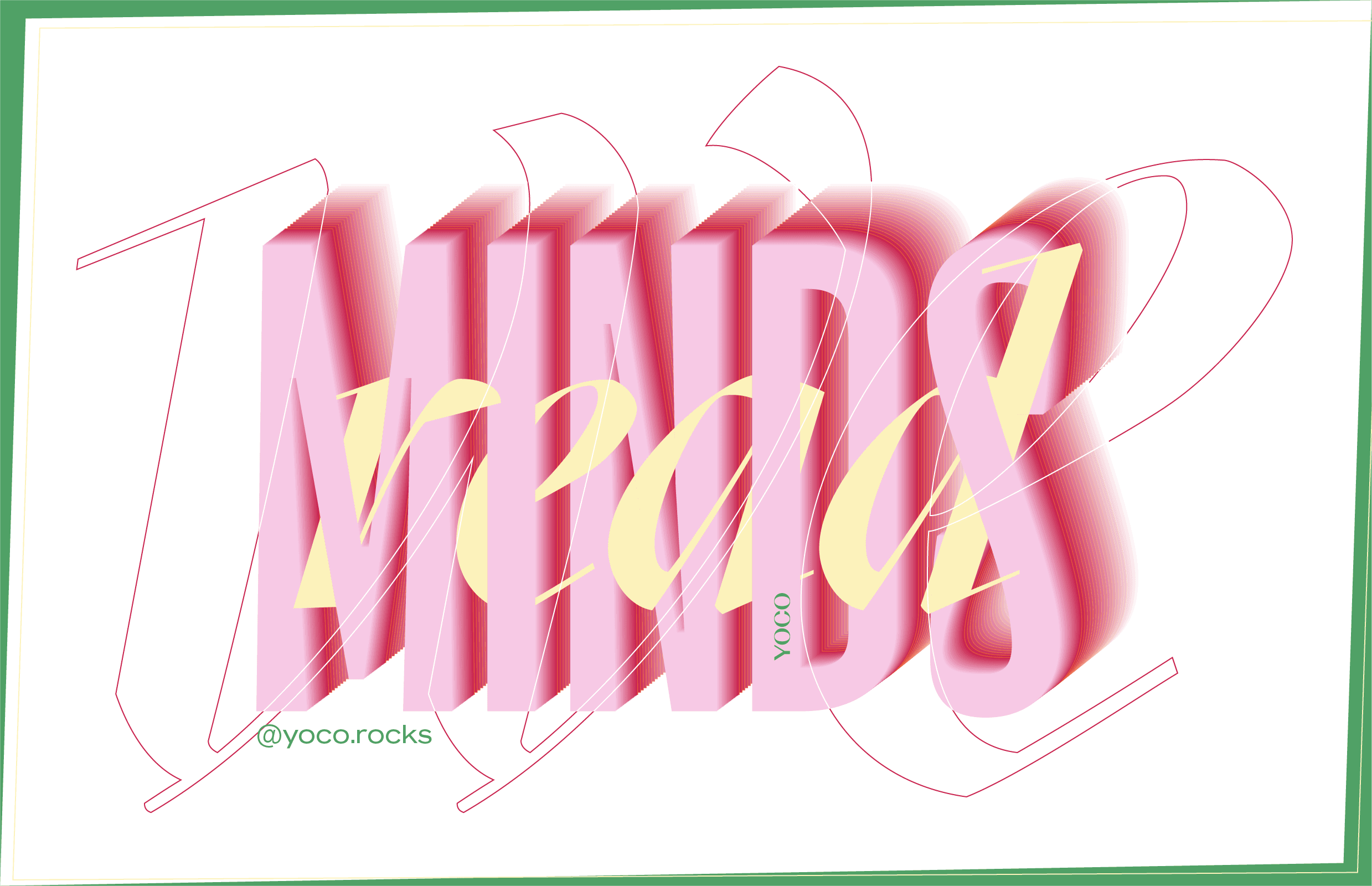
The logo went through another change prior to the one established today. We deviated with a style of typography that was already seen a lot in the tech world and after noticing it, we went straight to highlight its main trait: extravagant.
Light at the end of the road
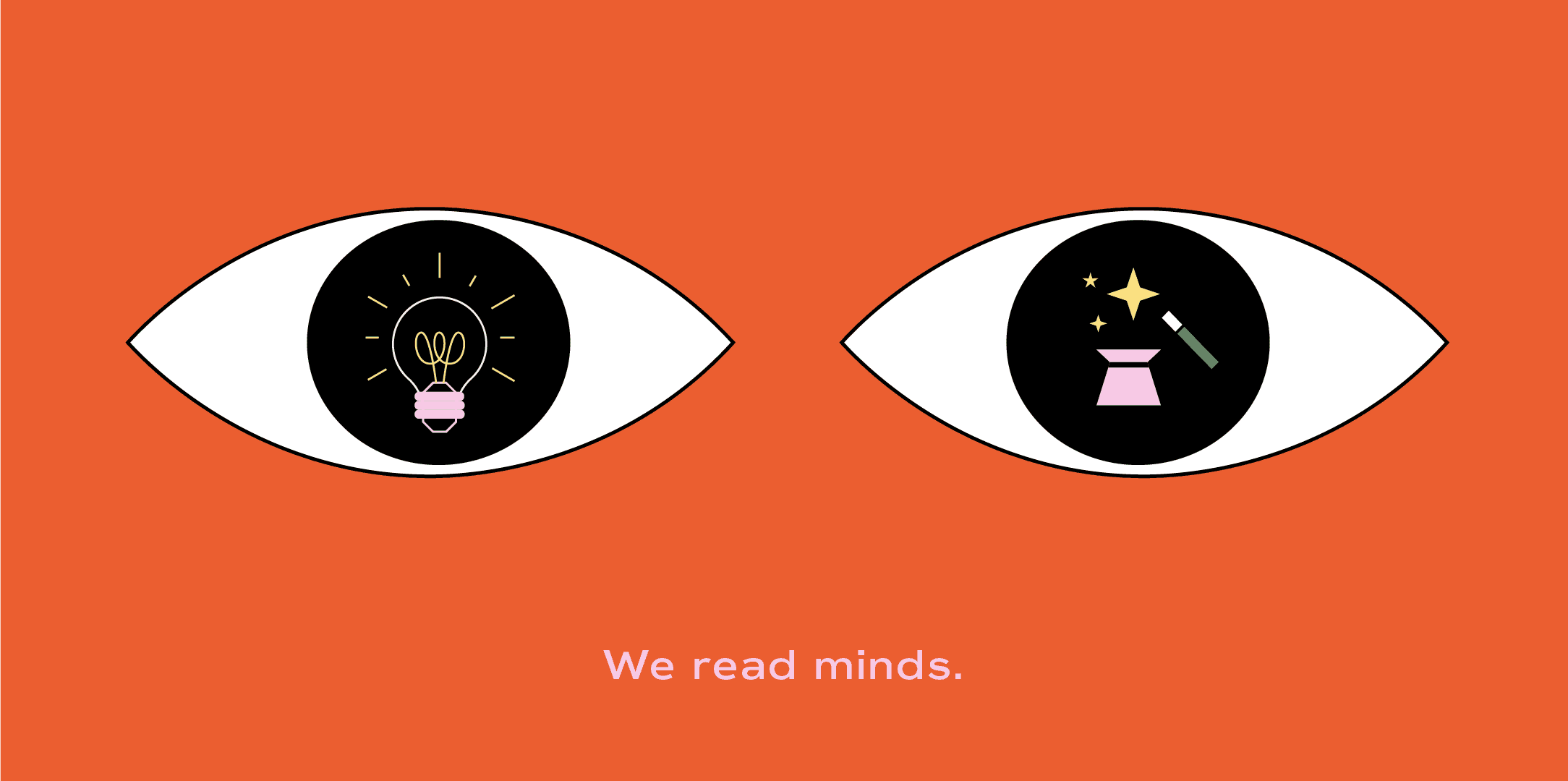
Conceptualize and represent them it in a bold way in their new identity and series of graphics that reflects their soul in their digital medium. Without lefting behind the beauty of business cards.


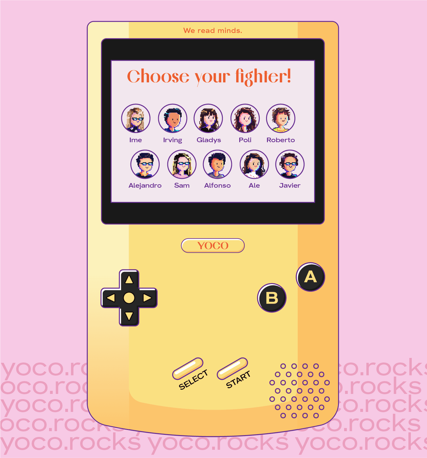
Yoco’s team is very diverse and all complement each other very well, especially with a playful and cheerful aura. Each fighter reflects their personality freely with their unique super power.
I'll say it, the portraits made in pixel art not only portrays each of them, but gives them their uniqueness and a voice, in unison and separately. Extracting the essence of each and abstracting it pixel by pixel was a task I definitely enjoyed.